Tap to start
Welcome







My role:
UX/UI Designer
Tools:
Figma, Dribble, ClaudeAI
Duration:
10 weeks
Team:
Independent project
Problem Space:
According to a survey conducted by the National Endowment for the Arts (NEA), the percentage of adults reading novels or short stories has declined by 17% in the past decade, attributed to shortened attention spans and the demand for instant gratification fueled by social media. Additionally, an abundance of reading choices overwhelms potential readers, prompting early abandonment of books or a lack of engagement altogether (Jamie, 2015).
Solution:
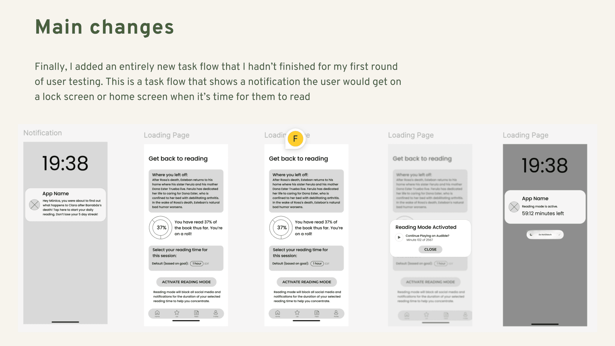
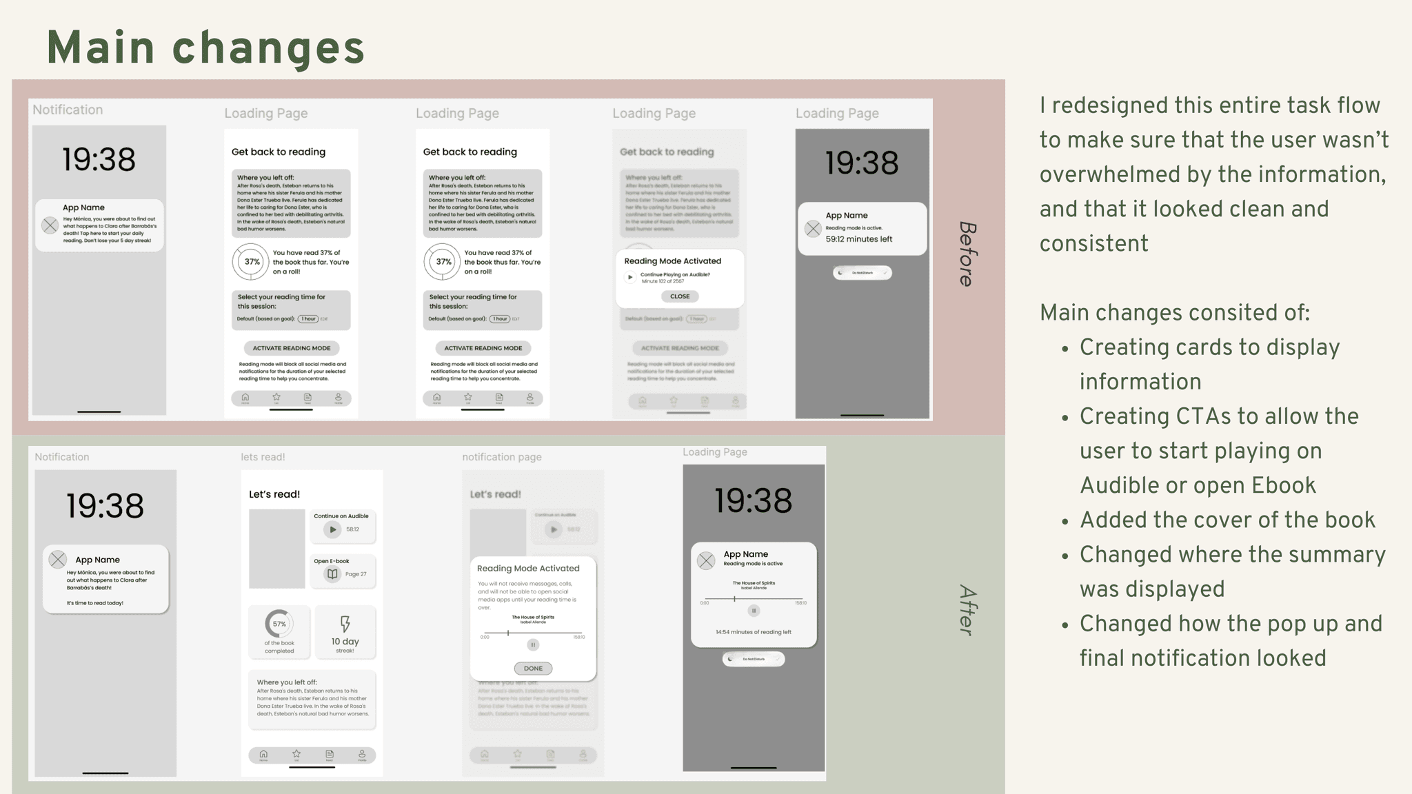
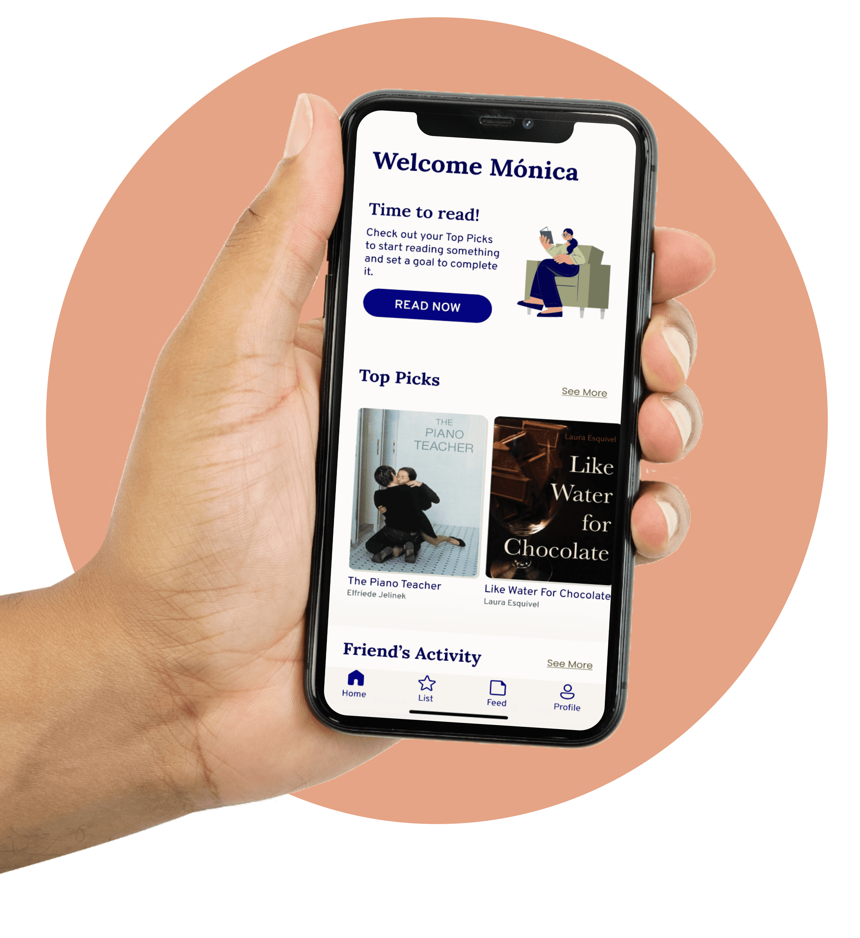
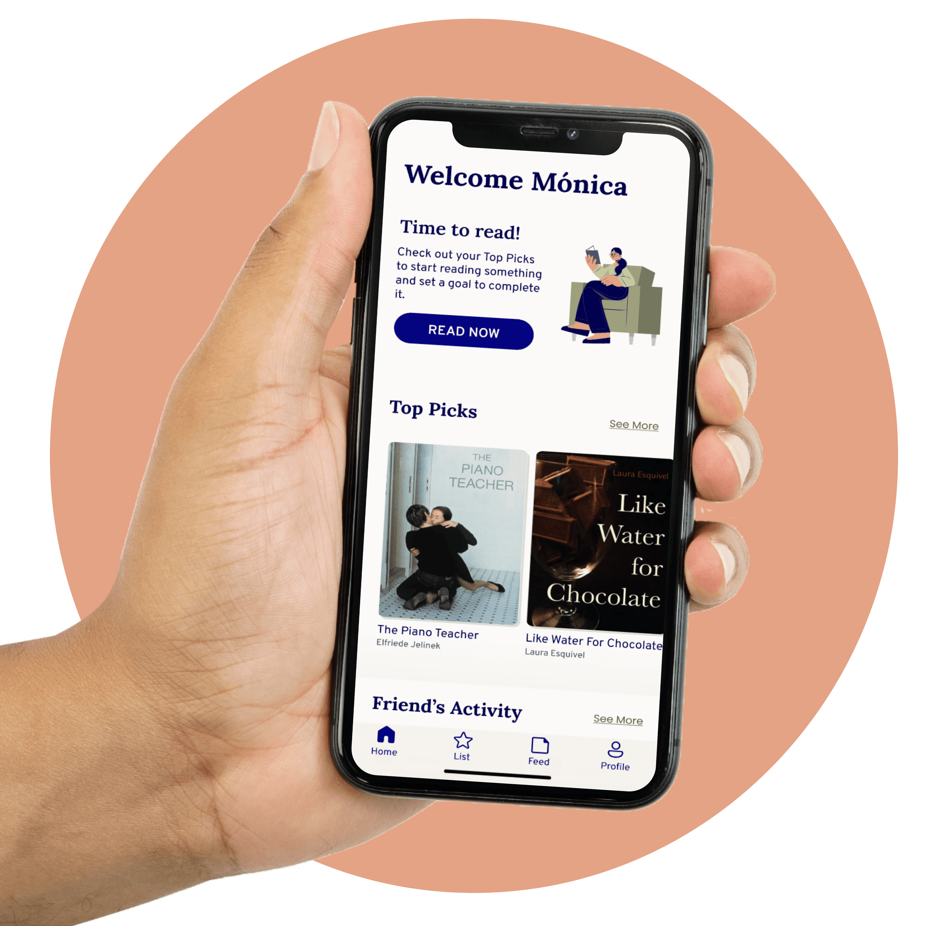
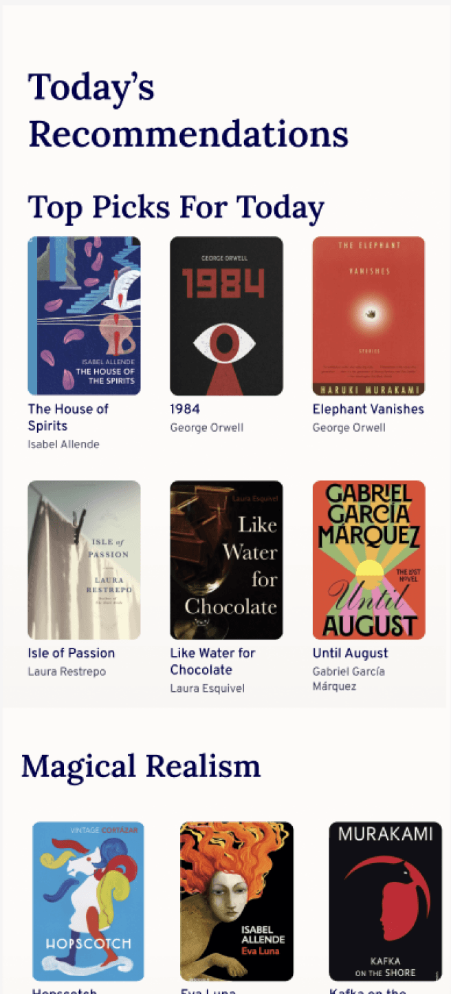
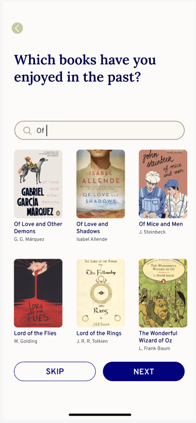
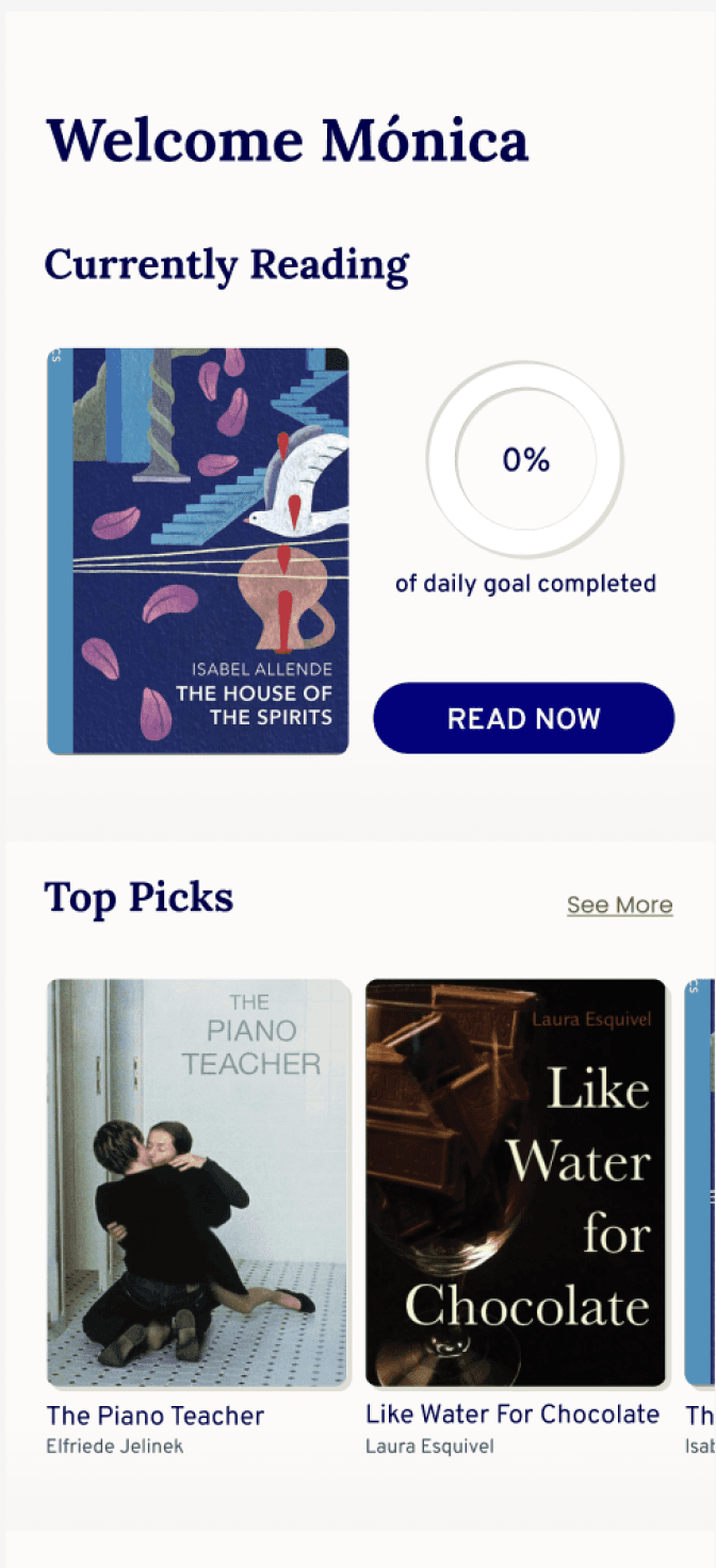
etcétera is a mobile app designed to make reading easy, enjoyable, and part of your daily routine by providing tailored book recommendations, allowing users to read and leave reviews, and connecting them with friends and like-minded readers. It helps users stay on track with reading goals through reminders, offers the possibiliity to read eBooks and audiobooks on the app, and disables phone distractions during reading sessions for a focused experience.
FEATURES
All the ways to read, at the tip of your fingers.
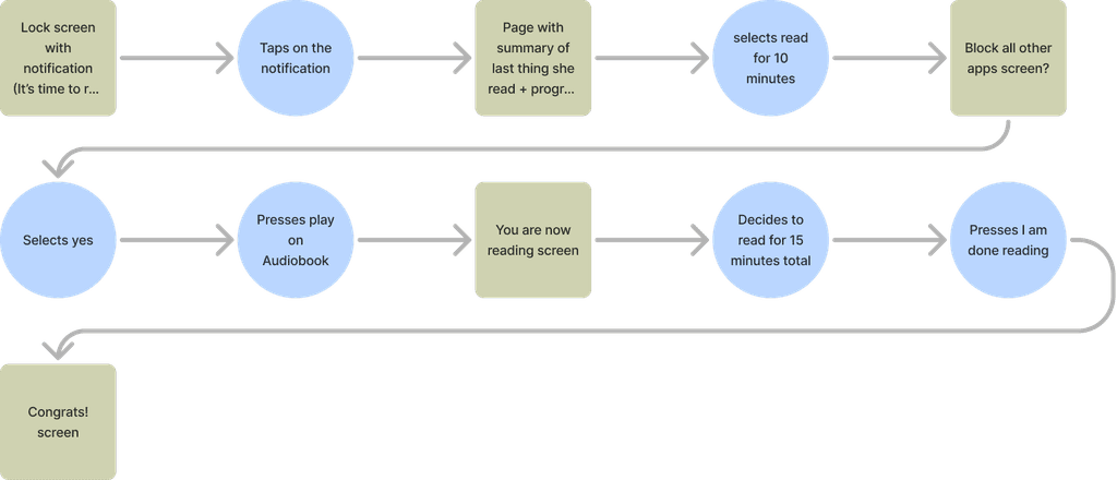
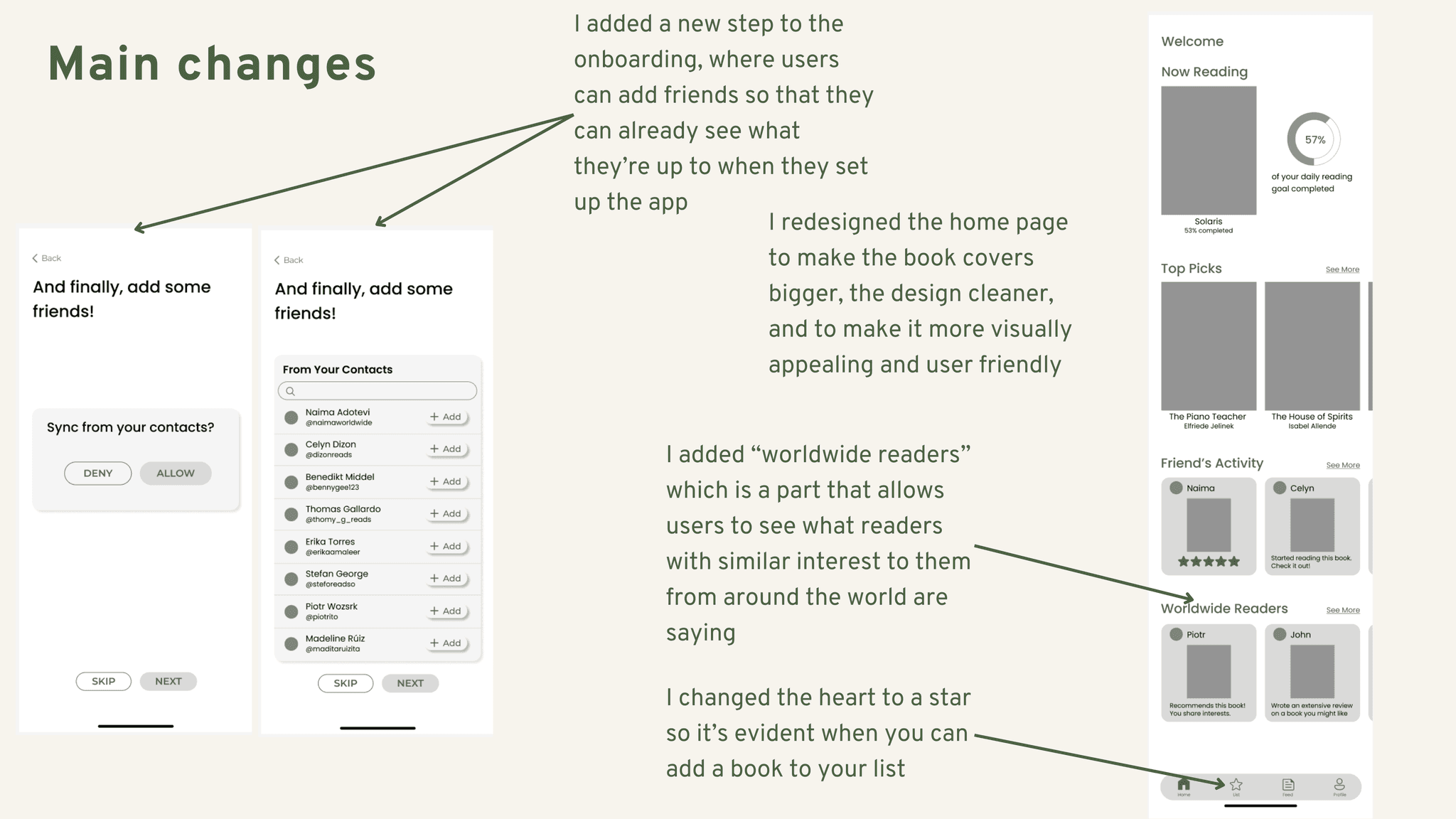
See how the book is rated, see if your friends have read it too, and see what they have to say about it. If it’s the right match, set a goal and start reading.
DESIGN PROCESS
Discover
To gather more in-depth insights on the topic, I interviewed 6 individuals between the ages of 20 and 35, ranging from avid readers to casual readers. My main goal was to understand the most common challenges and opportunities regarding their reading habits to try to understand their wants and needs the best.
Key Findings:
How might we:
help literature enthusiasts feel less overwhelmed by book choices, manage their reading time better, and engage more deeply with their reading, despite the distractions of modern technology?
Define
Who am I designing for?
The question remained.
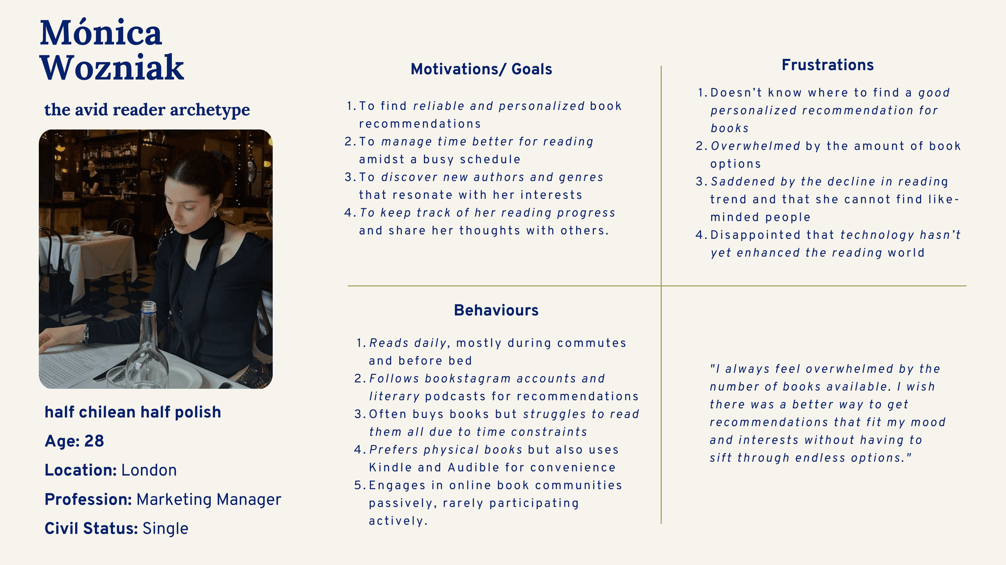
However, after exploring my problem space and identifying the pain points, goals and behaviours of my interviewees, I created a user persona who represented the core insights of my target users.
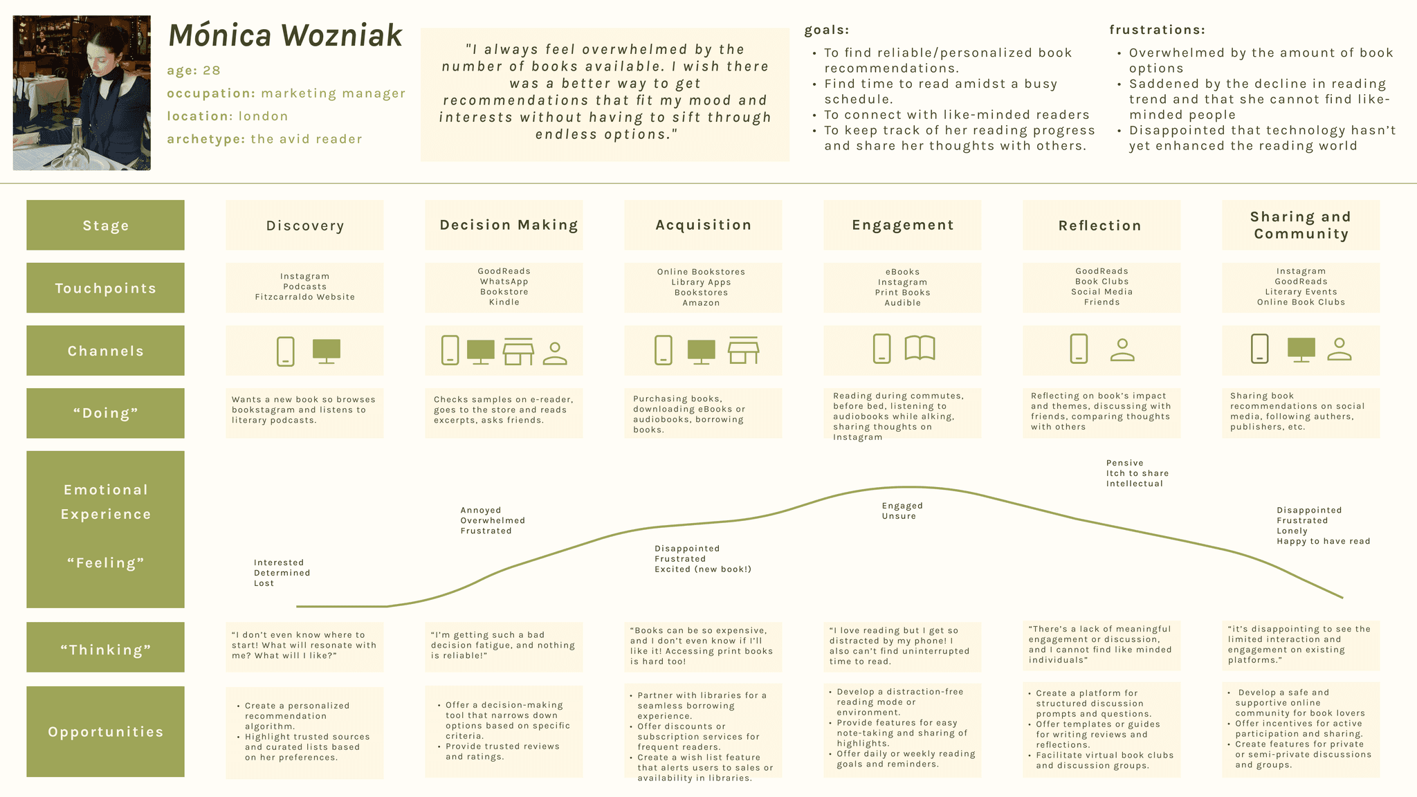
To gain a deeper understanding of my user needs I developed an experience map for Mónica's journey, and identified potential opportunities for digital intervention.
Key Solutions:
Where Can I Help?
Interviews, personas, and experience mapping provided a deeper understanding of the user's needs, from establishing consistent reading habits to discovering personalized book recommendations. I then narrowed down my potential solutions to the following:
Task Selection
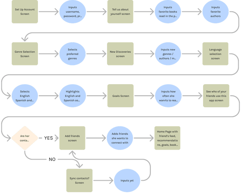
By crafting a series of user stories, I deepened my understanding of their goals and motivations. I then organized these stories into 4 key epics, and decided to use the following two epics to craft my task flows: Epic 1: Motivating Consistent Reading Habits and Epic 2: Discovering and Managing Reading Material
Develop
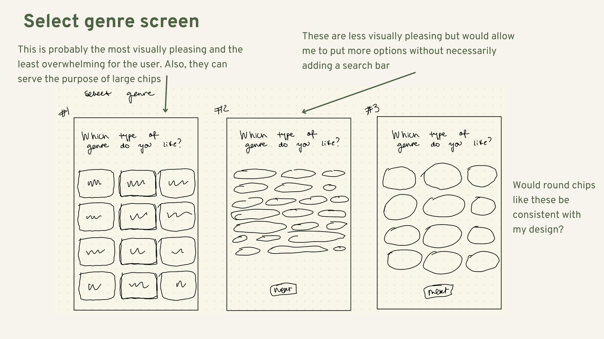
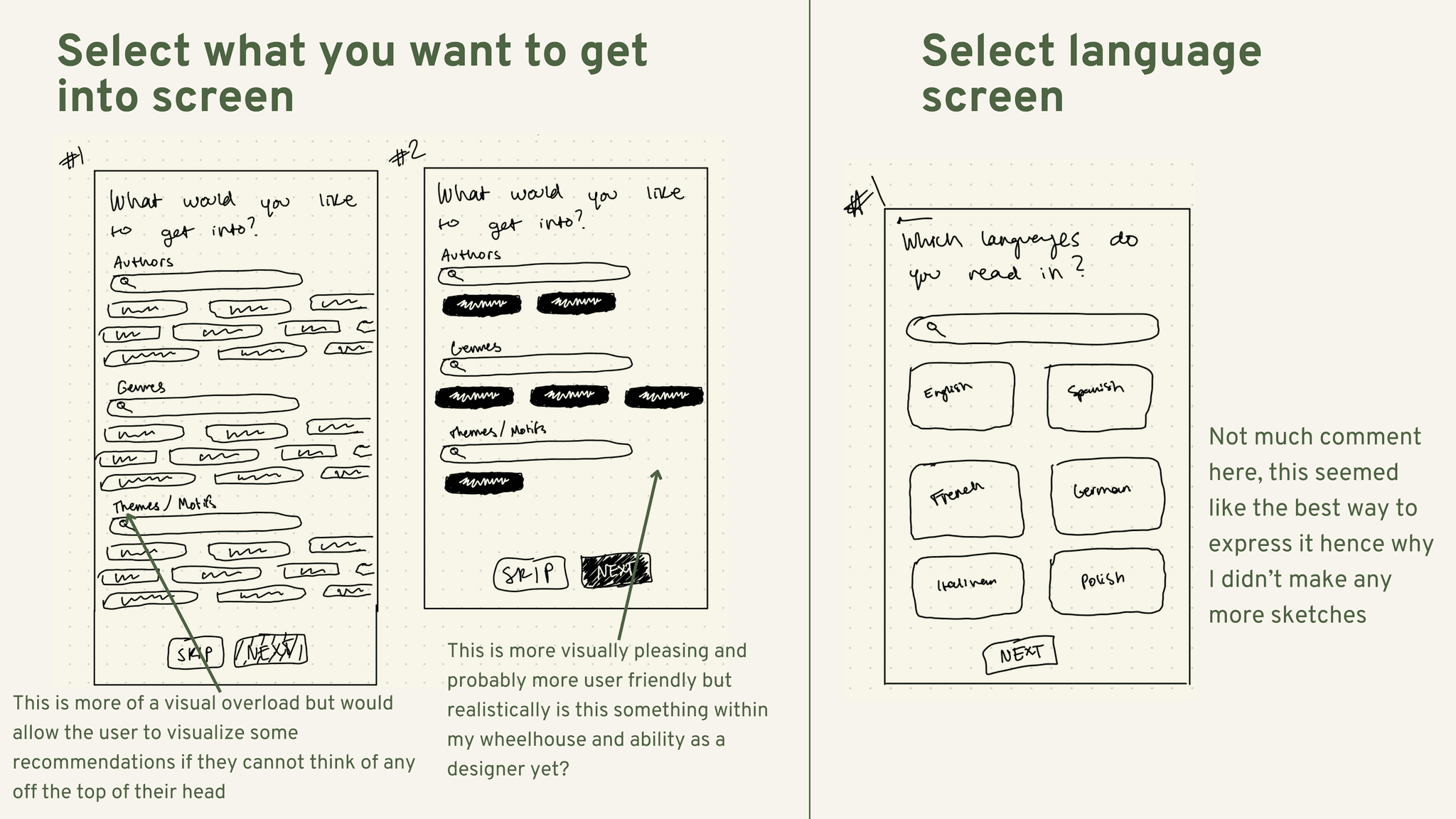
Initial Sketches
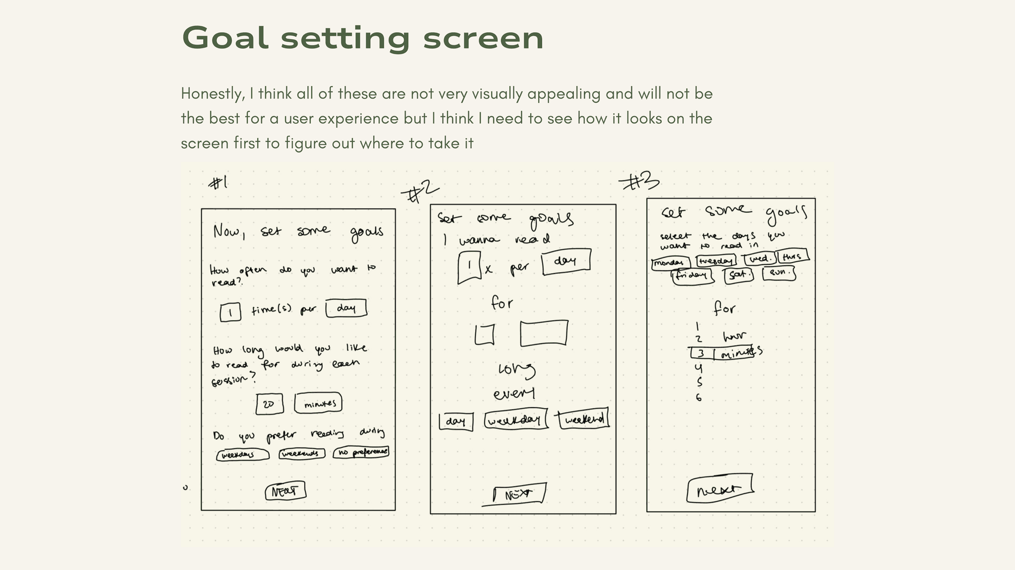
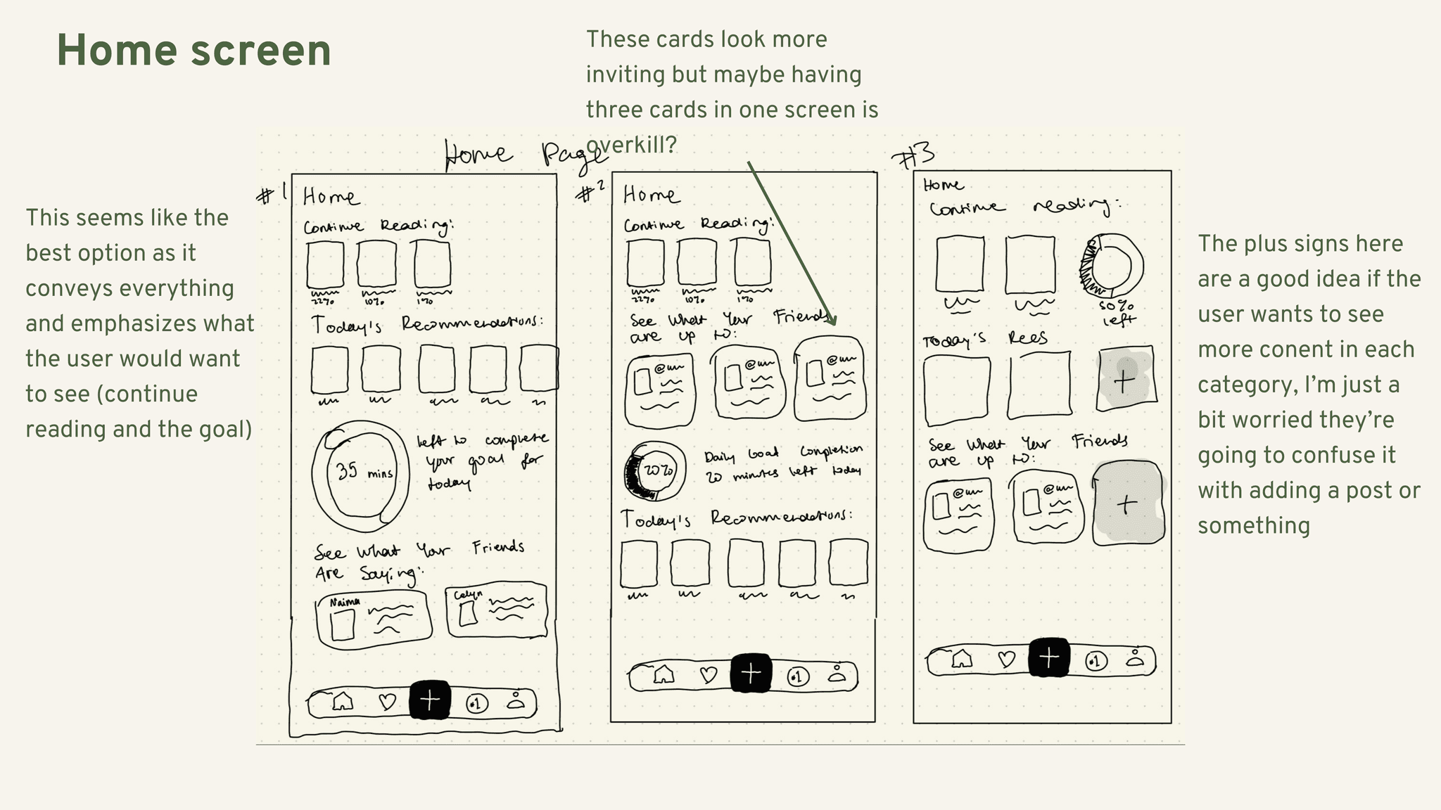
After crafting a UI Inspiration Board, it was time to sketch possible options for a final solution that would bring my task flows to life.
Wireframing
and User Testing
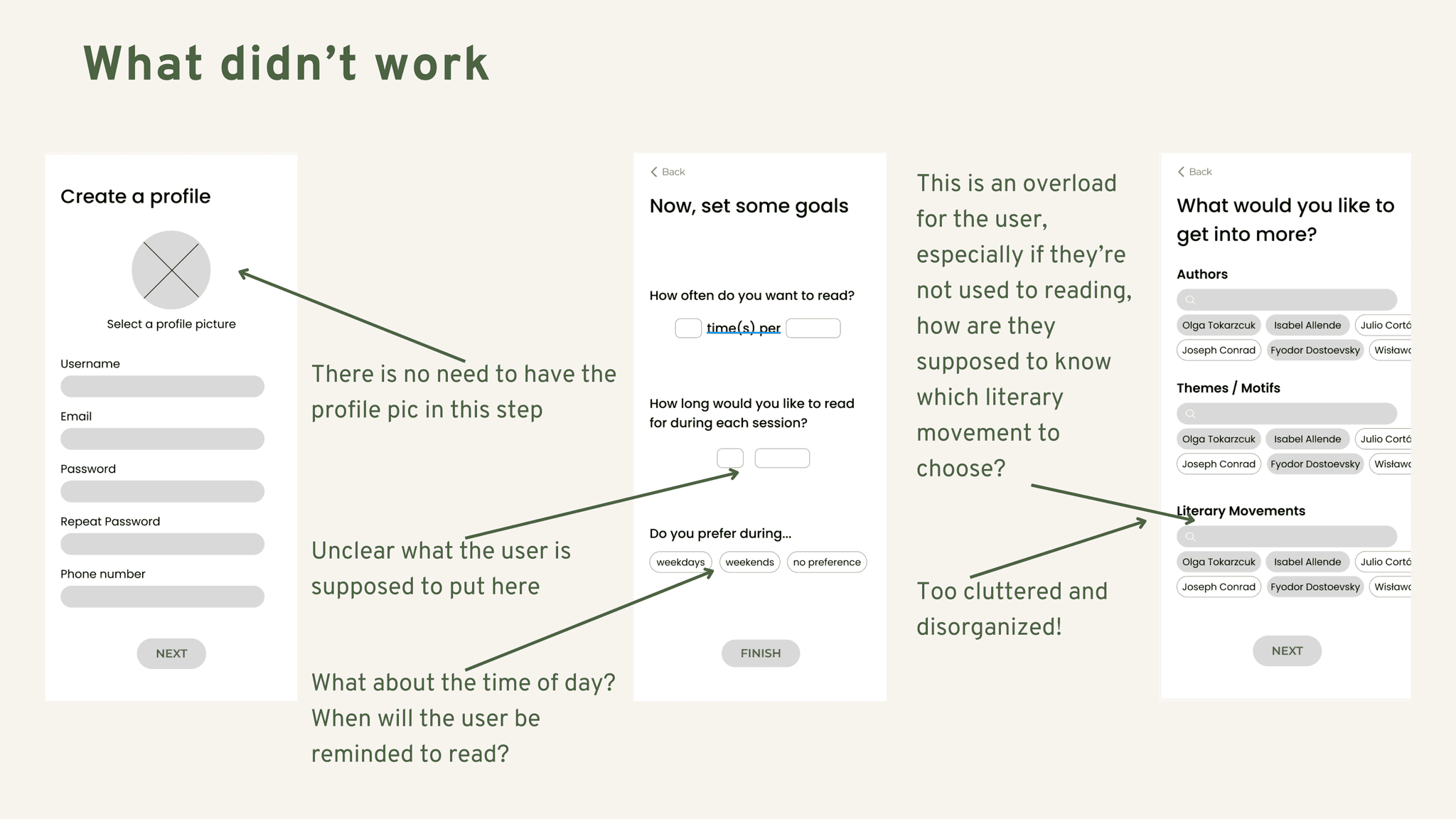
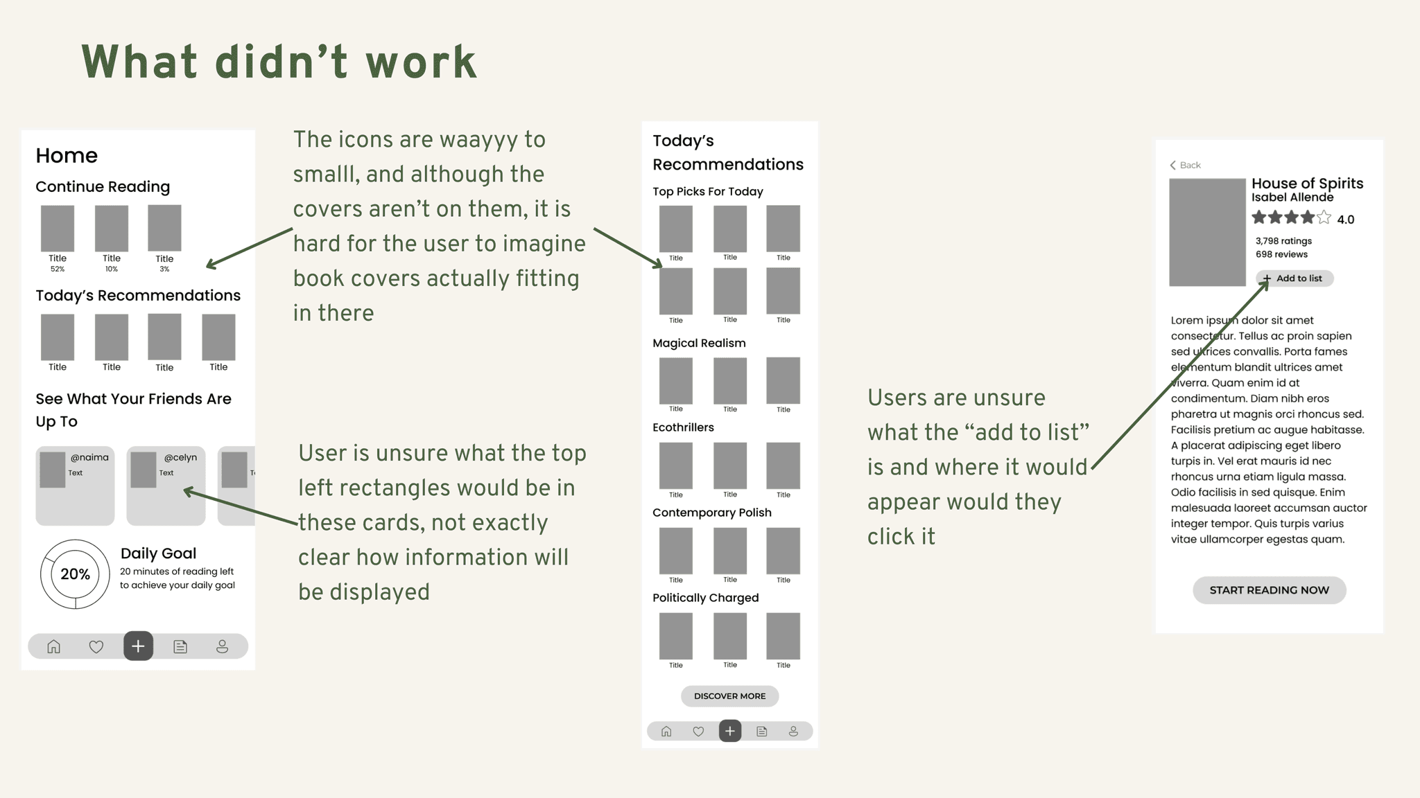
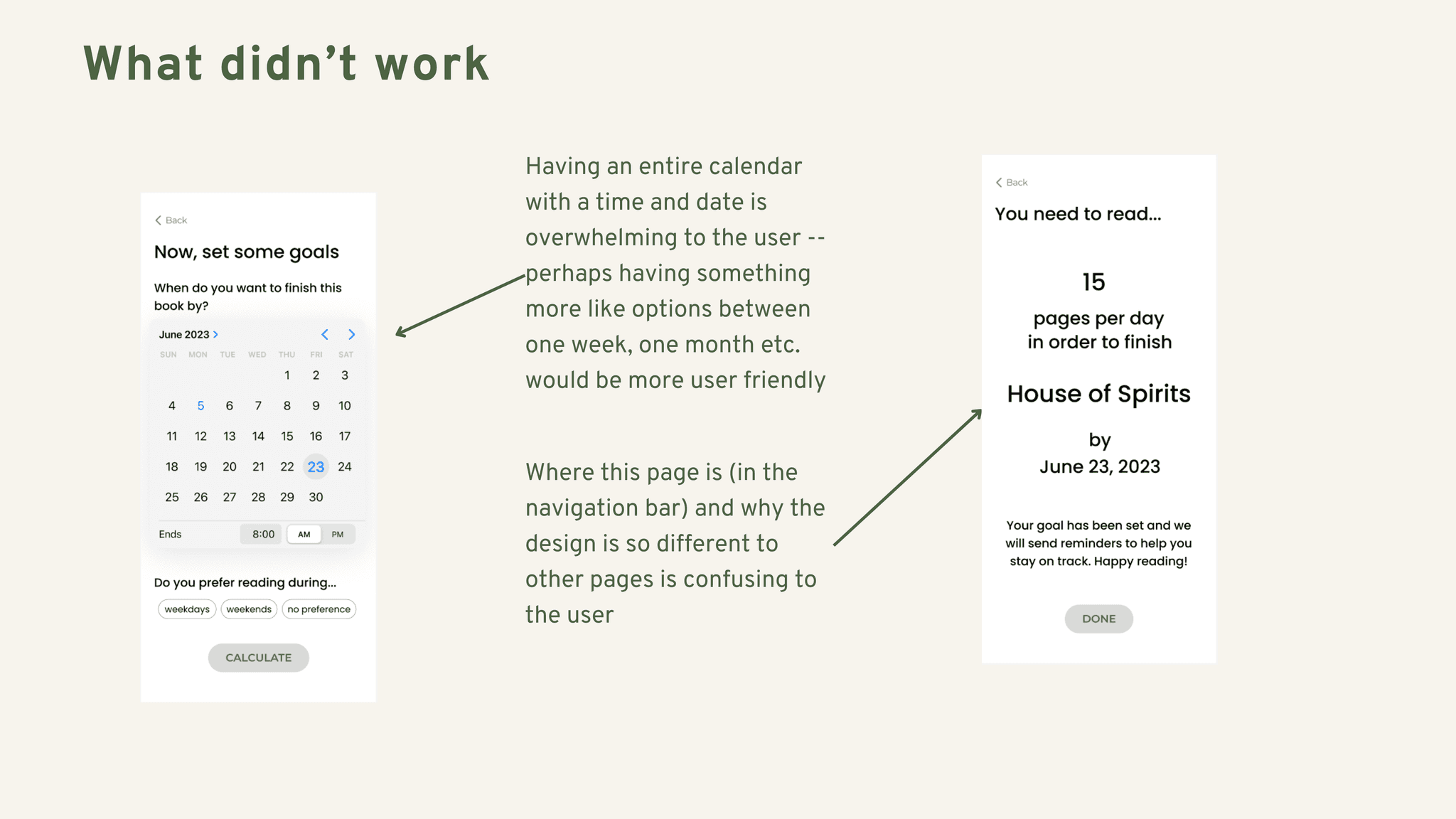
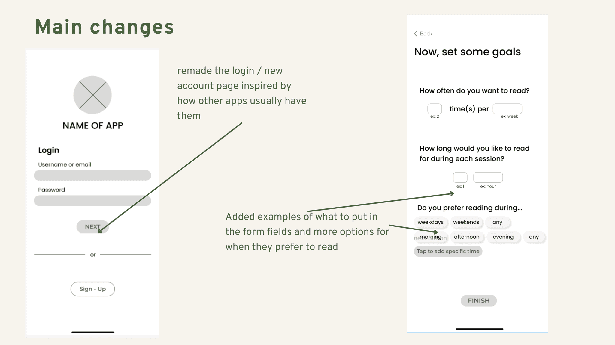
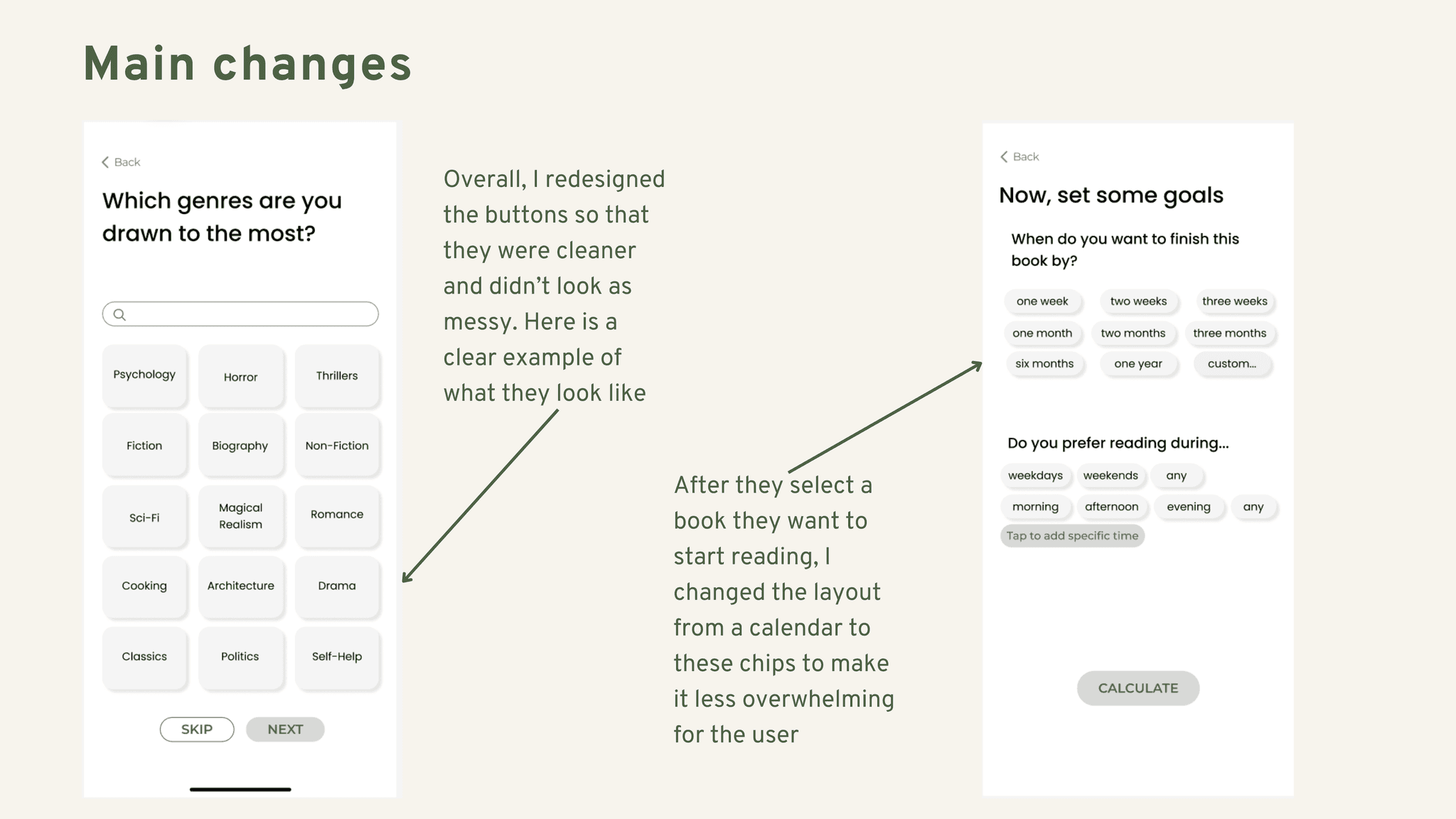
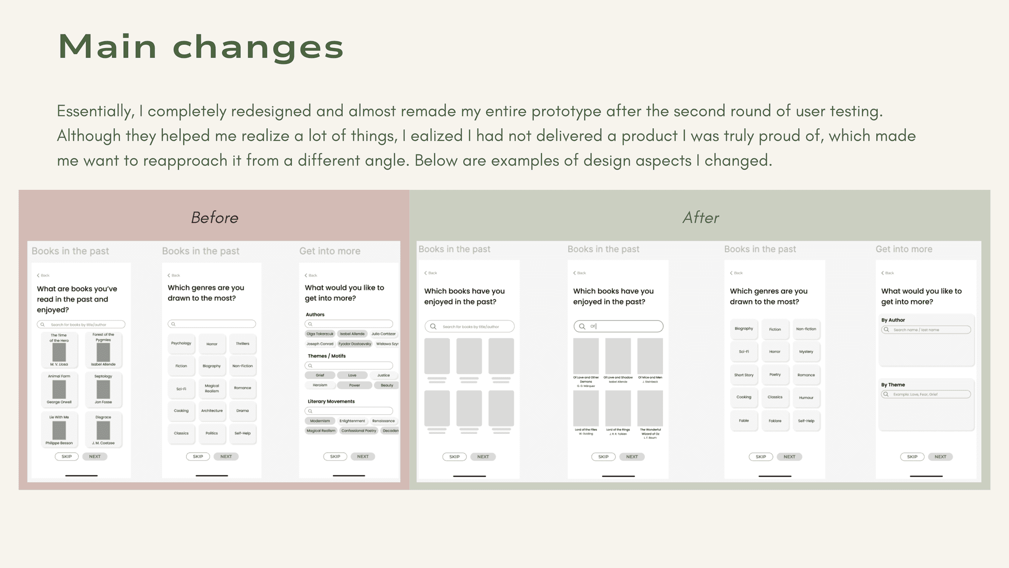
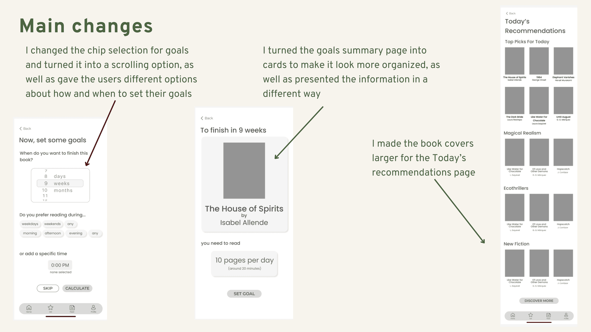
The next stage was to refine these sketches into greyscale wireframes and test them out on 2 rounds of 5 users - applying amendments where needed between both tests before developing the visual identity of the product.
Brand Development
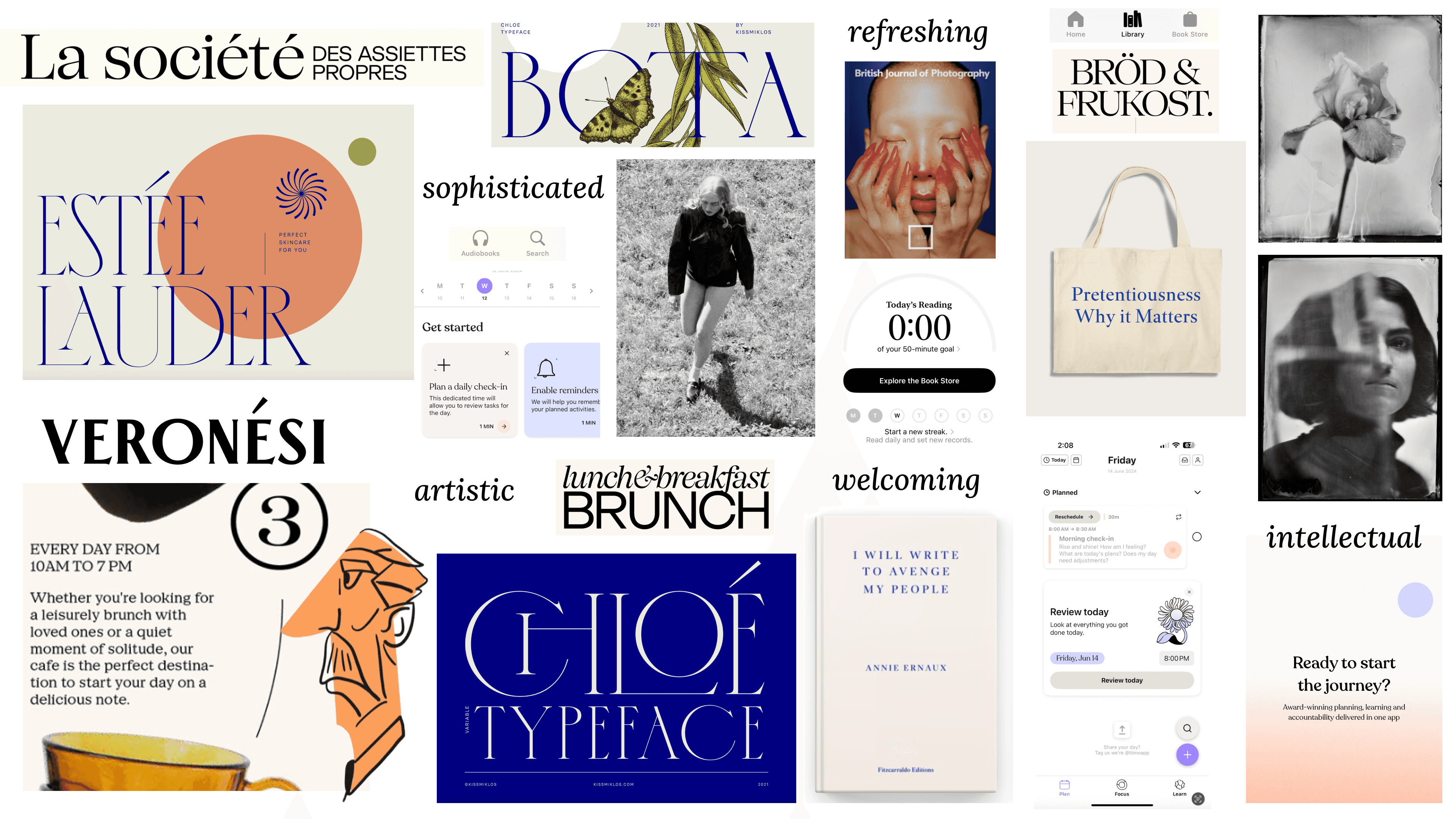
To develop the visual design of my app, I started by building its brand identity. This process involved exploring various elements such as imagery, shapes, textures, user interface patterns, and typography to create a cohesive and engaging experience.
The decision to name the app **etcétera** was inspired by the idea of making reading an ongoing, enjoyable journey. The name reflects the endless possibilities and stories that readers can discover. By positioning the app as a friendly companion in the world of books, I aimed to provide a personal and approachable touch while still emphasizing its core mission: making reading accessible, enjoyable, and a part of daily life.
Moodboard: Tone and Voice
Wordmark
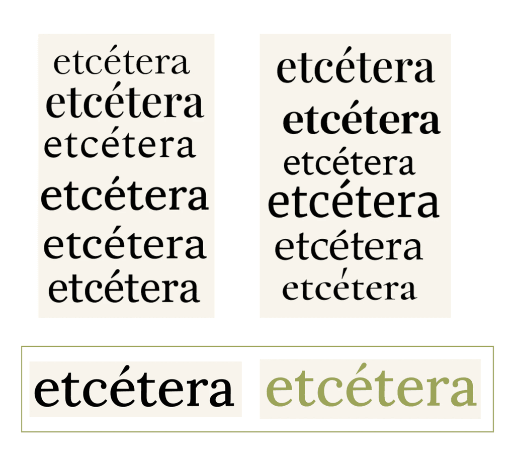
After naming my app etcétera, I explored various typefaces, aiming for a serif style that evoked an old-time newspaper feel.
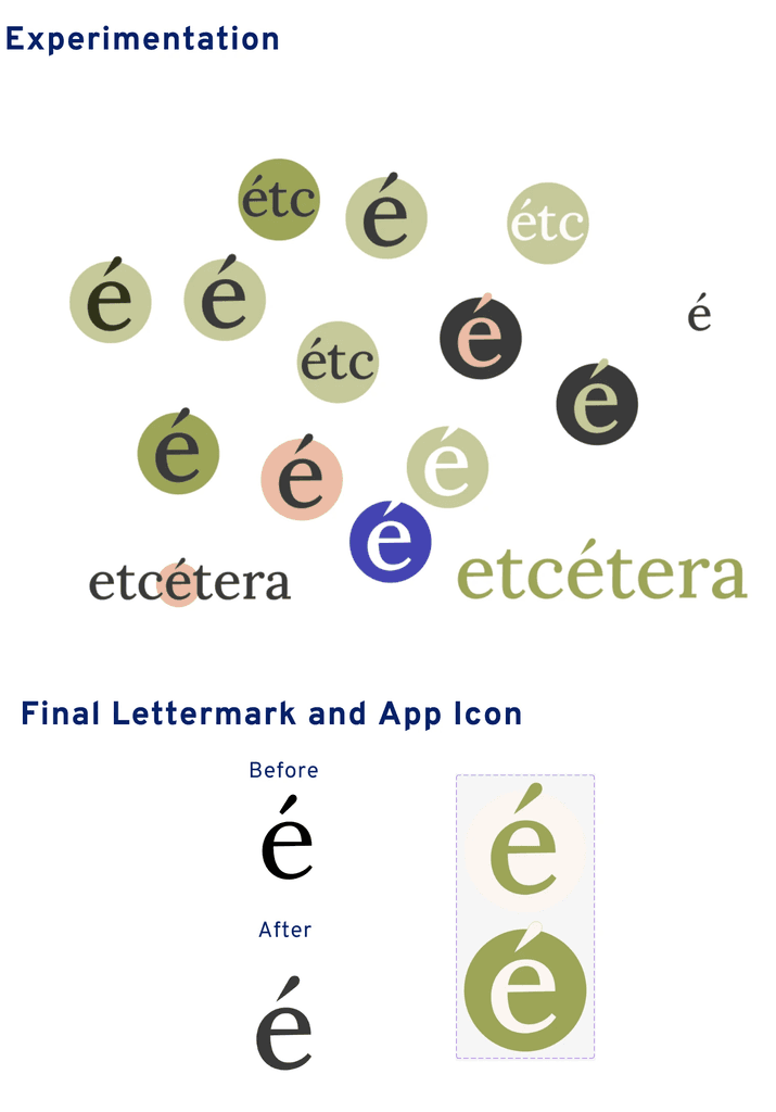
Based on this, I created the lettermark, which then turned into the app icon. Here you can see both versions, one with a white background and a green ‘e’, and one that is inverted.
Colour
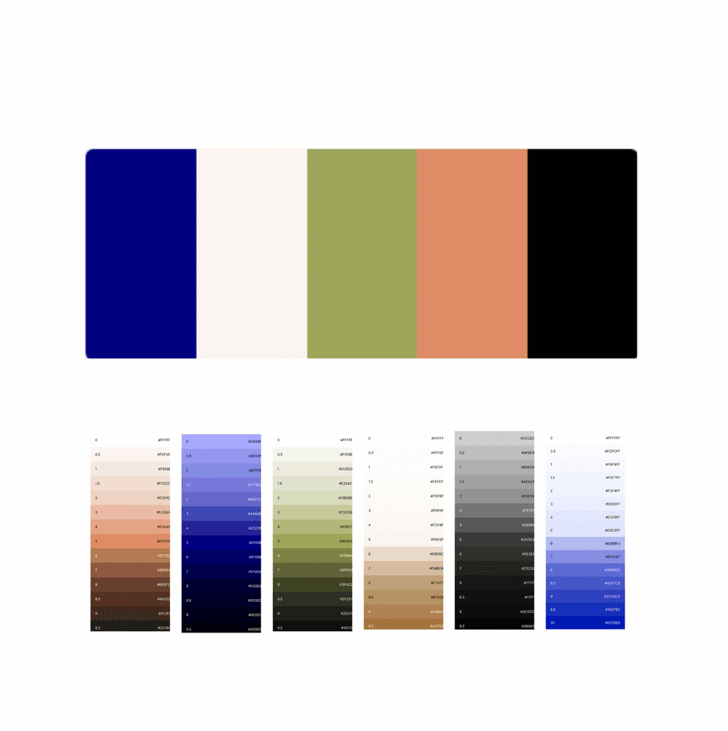
I created multiple colour palettes for my app, and ended up using the dark blue as my primary color for the text, the green for my branding colours, and the orange and creams for my neutrals.
Atomic Design
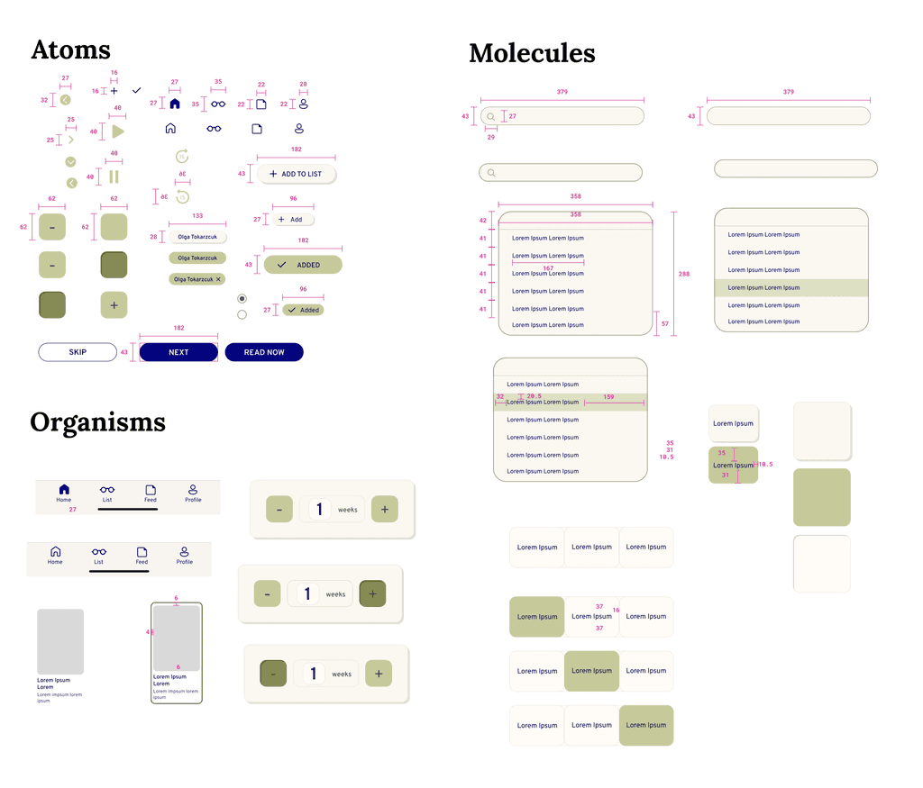
To ensure a cohesive and user-friendly experience, I developed a comprehensive UI library. This library includes standardized elements such as Atoms, Molecules, and Organisms all designed to maintain consistency across the app's interface.
Deliver
étcetera
for mobile
etcétera is a mobile app designed for avid readers, offering a modern and intuitive interface to assist users in discovering and enjoying new books while connecting with a like-minded community.
Prototype
Key Takeaways
etcétera is a project that I'm deeply passionate about. As an avid reader and aspiring author, my love for books has driven me to create an app that enhances the reading experience for others.
Through extensive research, including user interviews and usability tests, I've gained valuable insights into the needs and pain points of readers. I've learned the importance of tailoring every aspect of the app to the user, from the design of the interface to the selection of features. User testing has been crucial in refining the app, and I've come to understand the significance of color and brand identity in creating a compelling and cohesive user experience. This project taught me how to design solutions that help users take action and achieve their goals while always prioritizing their needs and concerns.
